
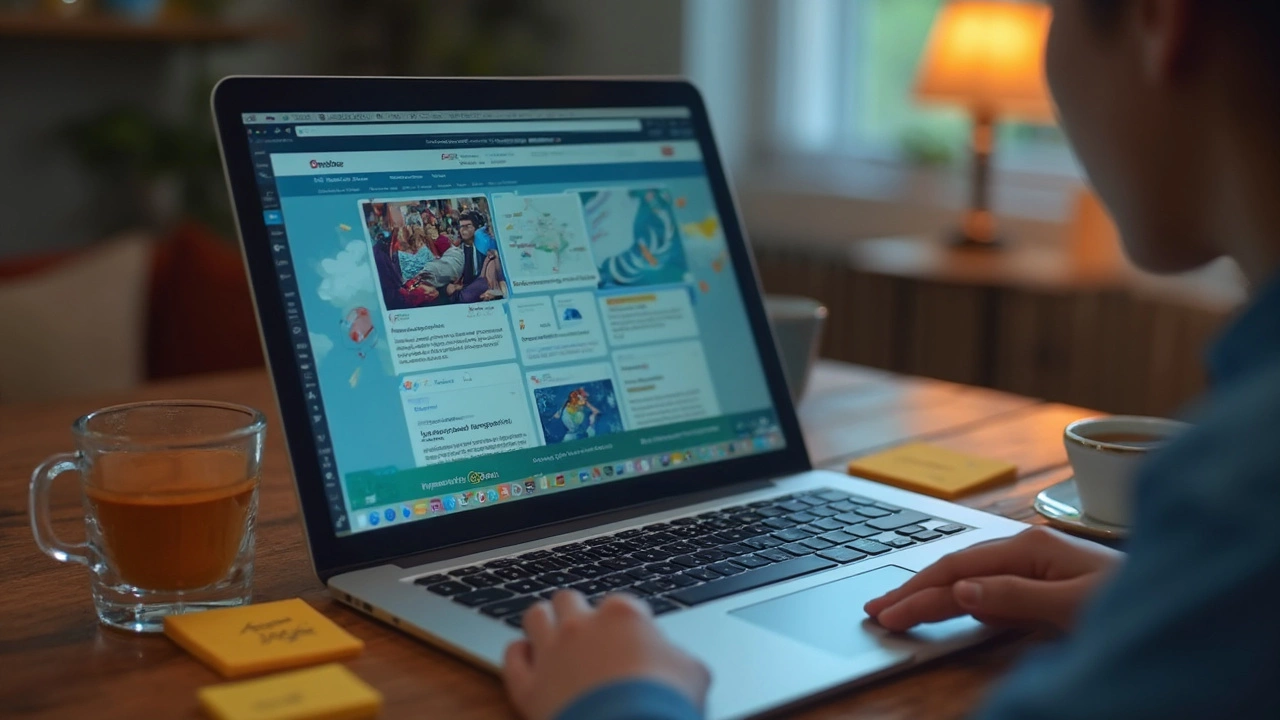
If you’ve ever found yourself lost in an online course dashboard, or stared at a quiz that wouldn’t load, you’ll appreciate why a good e-learning platform is such a lifesaver. Picking the right platform isn't just about slick graphics or promises of AI magic—it’s about day-to-day usability and the little things that help you actually learn, not just click around.
The right digital space should feel inviting. It shouldn’t take a tech wizard to figure out how to get started, submit homework, or review a lesson. You want clear menus, big buttons, and navigation that makes sense even if you’ve only had one cup of coffee. Some platforms even let you customize your dashboard or use dark mode, and it’s amazing how much those small touches help you focus.
I’m always amazed at how often people ignore accessibility. If someone’s using a screen reader, or dealing with spotty Wi-Fi, the platform should be ready for that. There’s nothing worse than getting locked out of your course because you use a certain device, or need subtitles that just aren’t there. If a platform handles these basics, it already stands out.
- The Heart of User-Friendly Design
- Content That Grabs (and Keeps) Attention
- Feedback and Progress Made Easy
- Tech that Actually Works (and Plays Nice with Others)
The Heart of User-Friendly Design
There’s nothing more frustrating than trying to learn when you can’t even find your next lesson. That’s why user-friendly design sits right at the core of any top-notch digital platform for e-learning. The best platforms keep things simple and direct—no hidden menus, no confusing icons, no mystery buttons. You should be able to see where you are, know what to do next, and get there in a click or two.
Sometimes, platforms throw in way too many features. Sure, it sounds cool in the brochure, but if it clutters the dashboard or buries the basics, students and teachers are going to bail. Research from the Nielsen Norman Group has shown that systems with fewer steps and clear labels lower dropout rates and boost satisfaction. So, every button and link should have a clear purpose—if it doesn’t, it’s just noise.
For folks juggling classes, work, or parenting (like me with my goldfish Cleo needing his food at the same time every day), speed matters. Good platforms load fast, even on a basic laptop or a mobile phone. Many users access courses on the go—according to a 2023 Coursera survey, about 57% of learners now switch between devices regularly. If your platform looks great on a desktop but falls apart on a phone, you’re losing half your audience.
Personalization is a huge plus—but only if it helps, not distracts. Things like switching to dark mode, changing font sizes, or adjusting notifications actually make life easier. Some platforms let you reorder modules or hide stuff you don’t need. That keeps your learning space focused and less chaotic.
Also, never overlook accessibility. Simple tools like alt-text for images, captions for videos, and keyboard navigation aren’t just for show—they decide if someone can actually use the platform. Digital learning should welcome everyone, so basic assistive features are a must, not just a bonus.
- Navigation must be obvious and consistent across all screens.
- Design should adapt to different devices—phone, tablet, laptop—smoothly.
- Performance needs to hold up even when your internet’s not perfect.
- Accessibility tools must be built in, not bolted on at the end.
If a platform nails these things, learners can stop wrestling with the tech and start picking up real knowledge instead.
Content That Grabs (and Keeps) Attention
Here’s the thing: nobody wants to sit through endless blocks of boring text or watch a video where the instructor sounds half-asleep. If you want a digital platform to work, the content has to actually pull people in—and keep them coming back to learn more.
Interactive elements really boost engagement. That means stuff like clickable quizzes, flashcards, or even quick polls mid-lesson. Real-world examples or short stories stick in the mind better than dry theory. Research from Harvard found that students using platforms with interactive content stuck with their courses 30% more than those on text-only setups.
The best platforms mix things up—videos, infographics, podcasts, and even memes or GIFs can break up the monotony and help information land. The key is making sure the content isn’t just dumped on users, but built to help them learn in different ways. Some people love videos, others just want a quick cheat sheet or practice problem.
- Keep videos short—ideally under 10 minutes. Data from edX shows modules under 6 minutes hold attention best.
- Offer regular knowledge checks—short quizzes or prompts every few screens help break up learning and boost retention.
- If you can, include case studies or real testimonials. Seeing how a concept works in the real world makes it stick.
- Add downloadable resources—checklists, templates, or slides can make it easier to review later.
It helps to know what actually works for learners. Here’s a look at features that get high marks for boosting attention and sticking power, according to a recent Coursera user survey:
| Feature | Reported Boost to Engagement (%) |
|---|---|
| Interactive quizzes | 47 |
| Short video lessons | 39 |
| Group discussion forums | 32 |
| Downloadable reference files | 28 |
So, to sum it up: platforms that layer different types of content and offer regular chances to interact or test yourself are the ones that actually keep people paying attention—and learning more in the long run.
Feedback and Progress Made Easy
If you want an e-learning platform that actually helps you improve, quick and clear feedback is a must. Gone are the days when you’d finish an assignment and wait around for days just to see how you did. The best platforms give you instant results on quizzes, let you check your answers, and show explanations that don’t leave you confused. Real-time feedback isn’t just a cool feature; research from the Bill & Melinda Gates Foundation found it boosts students’ learning speed by about 30% compared to those who wait for manual grading.
You should also be able to see exactly where you stand anytime you log in. Most top e-learning platforms have progress bars, modules checklists, and detailed dashboards. Seeing your growth keeps you motivated. Some platforms even send you reminders if you’re falling behind—a nudge that’s surprisingly helpful if you’re juggling work, pets (like my goldfish Cleo), and classes.
- Look for clear score breakdowns after every assignment or test.
- Platforms should offer comment threads or notes from instructors—not just “right” or “wrong.”
- A good digital platform lets you review past work, not lock you out once you’ve clicked “submit.”
- Badges or certificates can keep you going, especially for longer courses or skill-based training.
Quick feedback isn’t just about speed—it helps you fix mistakes before they turn into habits. According to a 2023 EdTech Impact report, 68% of students using platforms with immediate feedback said they felt more confident in their progress.
| Feature | Boost in Engagement/Performance |
|---|---|
| Instant Quiz Results | +30% faster learning (Bill & Melinda Gates Foundation, 2022) |
| Progress Dashboards | 65% higher course completion rates (EdTech Impact, 2023) |
| Personalized Reminders | 24% fewer missed assignments |
Bottom line: If a platform makes it hard to tell how you’re doing, or leaves you waiting for feedback, it’s time to look for something better. Learning should feel like a journey where you know exactly where you are and what’s next, every step of the way.
Tech that Actually Works (and Plays Nice with Others)
Here’s a simple rule: if the tech on an e-learning platform doesn’t actually work, or can’t connect with tools people already use, everyone’s going to get frustrated fast. A solid digital platform should feel invisible—it just does what you want, when you need it, no drama. Sadly, some platforms get in their own way, making students and teachers jump through hoops to open files or join live classes.
First, look for platforms with uptime you can trust. Most major services like Canvas, Moodle, and Google Classroom shoot for 99.9% uptime, which means almost no interruptions. But don’t just trust a claim—check their status history or what current users say on forums.
Next, let's talk about integrations. Nobody wants to copy-paste grades into a spreadsheet, or juggle six different logins. The best e-learning tools plug right into Zoom, Google Drive, Microsoft Teams, and even Slack. The smoother this is, the more time you have for actual learning.
- Single sign-on (SSO): Log in once, and you’re set for everything.
- Cloud storage: Upload assignments straight to Google Drive or Dropbox.
- Gradebooks that sync: Automatic updates, so no manual math.
Security and privacy are also huge. Look for platforms with regular security audits and simple privacy settings—GDPR compliance is now a basic expectation, not a bonus. Some schools even run their own servers for platforms like Moodle, so they control data access entirely.
| Platform | Uptime Claim | Key Integrations |
|---|---|---|
| Google Classroom | 99.9% | Google Drive, Meet, Forms |
| Canvas | 99.9% | Zoom, Office 365, Turnitin |
| Moodle | 99.8% | BigBlueButton, Google Workspace |
If you end up struggling with technical hiccups—dodgy video calls, laggy quizzes, files that won’t open—don’t be afraid to give feedback. Good providers actually listen and roll out updates. A tip: before committing to a platform for whole classes or programs, run a pilot with a small group. Real-world tests beat glossy demos every time.

Gareth Singh
I have dedicated my career to the field of education, focusing particularly on the dynamics of Indian educational systems and reforms. I find great joy in sharing my insights and experiences through writing, aiming to make education accessible and engaging for all. As an advocate for educational exploration, I believe in integrating cultural perspectives into learning to create a more enriching experience. In my work, I strive to inspire others to see the transformative power of education.
More Articles

Toughest Boards in India: CBSE vs ICSE Comparison, Facts & Insights
Discover which is the toughest board in India between CBSE and ICSE, with real stats, student perspectives, and essential tips to choose what's best for you.

Can You Study Abroad for Free? Costs, Scholarships, and Secrets in 2025
Is studying abroad really free? Explore hidden tuition costs, worldwide scholarships, and clever ways students save big money when moving overseas.

Is Aakash Enough for NEET Success?
Preparing for NEET can be a daunting task, and many students wonder if Aakash Institute's materials are sufficient. This article examines the strengths and limitations of Aakash's resources, providing insights from past students who have successfully cracked NEET. We'll explore study techniques, additional resources, and personalized tips to ensure comprehensive preparation for aspiring medical students.